FRESH INK FOR NO REGRETS
Brand Strategy, Visual Identity & Motion for a Luxury Tattoo Brand

From setting the standard to defining the pinnacle of next-generation tattooing
No Regrets had already built a reputation for doing tattooing differently. Its studios brought together exceptional artists, rigorous standards and a more considered experience for clients making one of the most permanent creative decisions of their lives.
But the ambition had grown beyond simply being a better tattoo studio. No Regrets wanted to lead the category: redefining what luxury tattooing could look and feel like, without losing the craft, character and culture that make tattooing so compelling.
We developed a complete brand strategy, visual identity and motion system to support that shift. The result is a brand built around precision, confidence and exceptional craft – elevated without becoming exclusive, and unmistakably connected to tattooing without relying on its visual clichés.
The Challenge: Building a brand that could stand above the category without stepping away from the craft.
Tattooing is rich in history, symbolism and visual culture. It is also a category filled with familiar conventions: gothic lettering, black-and-red palettes, heavy styling and a well-worn cast of skulls, roses and swallows.
None of those references could capture the breadth of No Regrets.
The business represents a house of artists working across different disciplines, from traditional tattooing to highly contemporary styles. Building the identity around any one aesthetic would have narrowed the brand and risked letting a particular genre define the whole organisation.
At the other extreme, making No Regrets feel simply like a luxury lifestyle brand would have stripped away the authenticity and expertise at its heart. The opportunity was to find a new space between the two: a brand elevated enough to signal the very highest standards, but human, credible and deeply connected to the practice of tattooing.
From 'The Standard' to something more ambitious
Our initial strategic direction focused on “The Standard”: articulating the consultation, professionalism, care and accountability that already distinguished No Regrets from much of the category.
The thinking was credible, but it wasn’t ambitious enough.
The client’s response prompted us to return to discovery and look beyond the operational strengths of the business. No Regrets was not trying merely to establish a better baseline for tattoo studios. Its ambition was to define the upper tier of the industry and help shape what tattooing becomes next.
That distinction changed the trajectory of the project. The strategy evolved from setting the standard to exceeding it, positioning No Regrets at the pinnacle of next-generation luxury tattooing.
No doubts. No Regrets.
Tattooing combines creative self-expression with an unusually permanent decision. For clients, the experience can involve excitement and anticipation, but also uncertainty: choosing the right artist, refining an idea, understanding how it will work on the body and feeling confident before committing.
Our conversations with the No Regrets team revealed how much of its process was designed to remove those doubts. Consultation, visualisation, iteration and testing were not simply operational steps. Together, they created clarity and confidence around a decision that cannot easily be undone.
This led to a pivotal strategic thought: to have no regrets, you have to start with no doubts.
While that line did not need to become a consumer-facing slogan, it gave the strategy an important human centre. Technology and innovation were repositioned as supporting infrastructure rather than the headline. Their role was not to make the experience feel futuristic for its own sake, but to help artists and clients make better decisions together.
Redefining luxury through control, not excess.
Before designing what a luxury tattoo brand should look like, we needed to agree on what luxury actually meant for No Regrets.
Rather than relying on price, exclusivity or obvious displays of status, we defined it through control: time, space, certainty, selective craft and an experience in which every detail feels intentional. This reflected a broader shift in contemporary luxury away from traditional status signals and towards brands defined by taste, confidence and ritual.
For No Regrets, that created an opportunity to be premium without becoming intimidating; sophisticated without losing its humanity. Luxury would be expressed through the quality of the experience and the confidence of the decisions – not through excess decoration.
That principle became the bridge between the strategy and the identity.
A visual identity confident enough to leave space.
The identity is built around clarity, calm and precision. Generous white space, restrained compositions and a carefully controlled typographic hierarchy give No Regrets the presence of a studio operating at a different level.
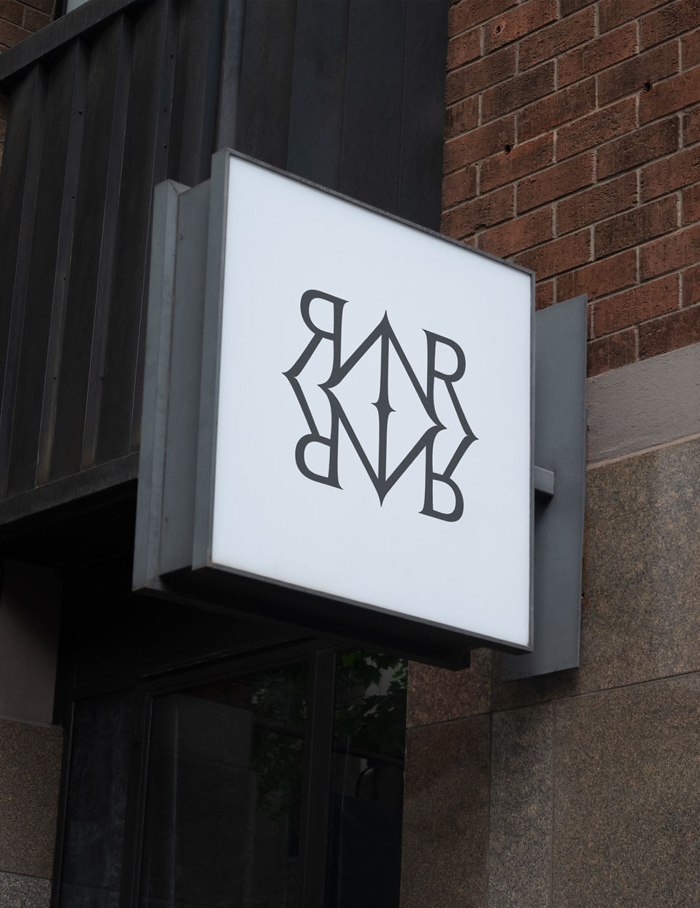
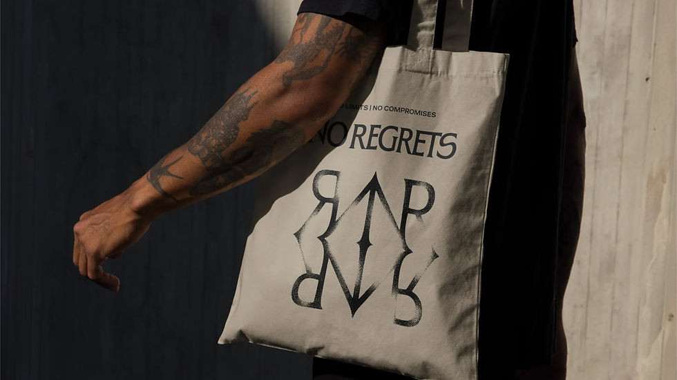
At the centre is the NR monogram: an interlocking cipher designed to feel architectural rather than ornamental. Its symmetry creates authority, while the sharpened central axis introduces a subtle sense of accuracy and precision.
The monogram works almost like a seal of quality, retaining its strength across digital applications, embossed print, packaging and physical studio environments.
The wider typographic system balances permanence with contemporary utility. A refined serif brings character and authority, supported by more functional typography that allows the identity to remain clear and flexible across everyday communications.
Colour is equally controlled. Near-black, charcoal and warm off-white provide the foundation, complemented by earthy tones of stone, ash and silver. Deep terracotta and slate teal appear sparingly, allowing them to carry more impact whenever they enter the system.
Precision, with the marks of the maker left in
Although the overall identity is refined, it was important that it never became pristine to the point of feeling sterile.
Translucent paper textures reference the transfer stencils used during the tattooing process, bringing tactility and the presence of the maker into the system.
A distinctive crop mark device borrows from print production, framing words and images without containing them. It introduces a sense of exact placement while also echoing the small registration marks used to align tattoo stencils on skin.
The needle mark system takes the relationship with the craft a step further. Its dot formations are derived from real tattoo needle configurations, each associated with a particular function or technique. Used as punctuation throughout the identity, these marks create a proprietary graphic language rooted in how tattoos are actually made.
Together, these elements allow precision and craft to coexist. The system feels controlled, but never clinical; premium, but never detached from the hands-on practice behind the brand.
Stepping outside the category without losing the culture.
We deliberately moved away from tattooing’s most established visual shorthand: blackletter typography, predictable iconography, heavy gothic styling and the ubiquitous red-and-black palette.
Instead, we looked towards the quieter confidence of contemporary fashion, editorial and lifestyle brands.
The intention was not to disguise a tattoo studio as a luxury brand. It was to create a new visual expression of luxury that belonged specifically to tattooing.
That distinction is visible throughout the identity. Each element feels elevated, but its rationale can be traced back to the tools, rituals and precision of the craft. The result can represent a diverse house of artists without favouring one tattoo style over another, and give No Regrets a distinctive presence beyond the conventions of its category.
Bringing the craft to life through motion.
The motion language extends the same balance of classic craft and contemporary confidence.
Movement is clean, slick and deliberate. Smooth easing creates composure, while a quicker pace and sharper transitions prevent the identity from becoming too formal or precious. The result feels modern and edged with attitude, without introducing unnecessary complexity.
Typography moves with a more classic, considered rhythm, reflecting the serif-led identity and the heritage of tattooing. Around it, framing devices, crop marks and borders move decisively into place, directing attention and creating changing structures for imagery and content.
The monogram provided the most natural connection between motion and making. Its animation gradually forms the mark as though it is being tattooed into place – a subtle reference to ink being applied to skin rather than a literal recreation of the process.
Motion therefore does more than add energy to the static identity. It reveals the thinking inside it: preparation, precision and the controlled act of bringing something permanent into being.
The Outcome: A brand system designed to lead, not follow.
The finished identity gives No Regrets a distinctive space between the conventional tattoo studio and the polished but often generic premium brand.
Strategy, design and motion work as one connected system. Every element, from the consultation-led positioning to the monogram, needle configurations and animated framing devices, reinforces the same principles of confidence, control and exceptional craft.
The result is a brand capable of representing different artists, styles and studio experiences without losing its centre. It feels sophisticated but approachable, precise but human, and elevated without ever forgetting where it came from.
More than a new identity, the work gives No Regrets a platform for its next stage of growth and a visual language for the future of tattooing it wants to help create.
Building brands with something worth saying.
Whether you're relaunching an icon or creating something entirely new, we help brands uncover what makes them culturally relevant, then build identities that make people care.
WHAT WE DID
BRAND STRATEGY
BRANDING
DESIGN
ANIMATION & MOTION GRAPHICS


Hey! What? were a pleasure to work with.
Being a creative team ourselves it can be complicated to work with other creatives but we managed to come together to recreate our entire brand identity. They took the time to understand who we were, where we came from and we wanted to be, it became a real team effort.
BEN LAKIN
Owner – No Regrets