SILVER HAYES: THe beating heart of glastonbury festival
BRANDING GLASTONBURY’S HOME OF DANCE MUSIC
WHAT WE DID
BRAND
DESIGN
PRINT
Silver Hayes marked it's 10 year anniversary at Glastonbury Festival 2023 with new transformed stages and an epic electronic and dance line-up.
Hey! What? has been behind the branding for Silver Hayes since it changed name from 'Dance Village' in 2013. For the 2023 festival, we were tasked with reimagining the overall brand to bring a fresh aesthetic across all touch points including line up posters, artist cards, merchandise and paste-ups. The unveiling of several new stages gave us the opportunity to flex our 2023 branding further.
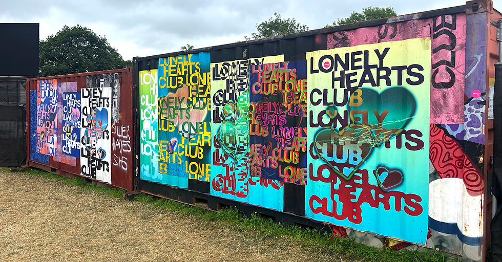
We worked closely with Bristol-based production studio Hidden Corners to create large-scale wall paste-ups across the various areas. The aim was to create designs that would complement the epic stage builds and to create a cohesive visual landscape.
Each stage area was given its own personality, but still in keeping with the overall Silver Hayes look and feel.
THE CHALLENGE:
Homestead isn’t just another festival. With a 1,500-capacity, a 25+ age requirement, and a weekend of curated experiences from music to foraging talks, this is a concept that demands a unique visual identity. The brand needed to capture the festival’s warmth, community spirit, and rural roots while standing out in a crowded market.
Complicating matters, the site itself couldn’t be revealed at launch. The challenge, then, was to design an identity that evoked the festival’s ethos without directly showcasing its location.
We developed a brand aesthetic that feels organic yet striking, mirroring the festival’s balance of tranquility and vibrant energy. Inspired by Homestead’s Somerset setting in the Mendips, we leaned into earthy, natural tones that reflect the land. The brand extends beyond just music, it’s about reconnecting with nature, whether through guided walks, communal meals, or morning yoga sessions.
To complement the rustic feel, we introduced bold contrasting elements, ensuring the identity could also carry the eclectic and dynamic music lineup. This interplay between natural textures and vibrant hues allows the brand to flex across different touchpoints while maintaining cohesion.
Homestead is an ‘experience’ festival, so it needed an ‘experience’ website. More than just a lineup and ticketing page, we designed an immersive, interactive journey that invites users to explore the festival world before even setting foot on site.
Visitors are guided through a seamless scrolling experience, enhanced with hover interactions and parallax effects that create a sense of depth and motion. To ensure both usability and engagement, a persistent sticky burger menu provides intuitive navigation, keeping content discoverable and enhancing SEO performance.
A festival brand that welcomes, excites, and inspires. Homestead is more than a weekend away; it’s a return to the land, to community, and to the music that brings us all together.
Looking to engage new audiences with a stretgic-led rebrand? Get in touch.
RELATED CASE STUDIES
MASSIVE ATTACK
A campaign and website for Bristol's biggest export… in record time
DMC
One of the most culturally significant brands in DJ culture
MAISIE PETERS & ATLANTIC RECORDS
Album launch for a global superstar


![240627_silverhayes_LB_Thurs_SKREAM&BENGA-8743 [Web].jpeg](https://static.wixstatic.com/media/12695b_6fc3a8939fd94d168f11c6588a3a7c3e~mv2.jpeg/v1/fill/w_980,h_1469,al_c,q_85,usm_0.66_1.00_0.01,enc_avif,quality_auto/240627_silverhayes_LB_Thurs_SKREAM%26BENGA-8743%20%5BWeb%5D.jpeg)
![HNKC_240627_GLASTONBURY_SliverHayes-3177 [Web].jpeg](https://static.wixstatic.com/media/12695b_279c74a8c48e4f6abcb9b0ca177f3263~mv2.jpeg/v1/fill/w_980,h_653,al_c,q_85,usm_0.66_1.00_0.01,enc_avif,quality_auto/HNKC_240627_GLASTONBURY_SliverHayes-3177%20%5BWeb%5D.jpeg)

![250628_SILVERHAYES_2025_JakeDavis__jakephilipdavis__khromacollective-8158 [Web].jpeg](https://static.wixstatic.com/media/0a5efb_012da3627288420bb4e5fc01aa66ee19~mv2.jpeg/v1/fill/w_980,h_1470,al_c,q_85,usm_0.66_1.00_0.01,enc_auto/250628_SILVERHAYES_2025_JakeDavis__jakephilipdavis__khromacollective-8158%20%5BWeb%5D.jpeg)


